In Brief

The Need: Update the Subscription Management portal to reduce obstacles to individual and automatic payments.
Skills In This Case Study:
- Experience Design
- Visual Design
The Result: An experience that surfaces the right content at the right time, reducing steps to payments being made and ultimately increasing automatic payments made by 20% and revealing a key customer experience gap.
Refined Requirements
In its initial state, the portal provided all of the right information, but how and when it surfaced the information could be confusing to users, reducing clarity.
But to solve this, “clarity” had to do be defined. This would drive the research stage.
The requirements included:
- Improved friction use
- Improved screen space use
- Additional surfacing of billing data at the portal view
- Additional actions available to the user at the portal view
- Holistic improvement to provide clarity
Research Strategy: Defining Clarity
To define “clarity,” research took place with this strategy:
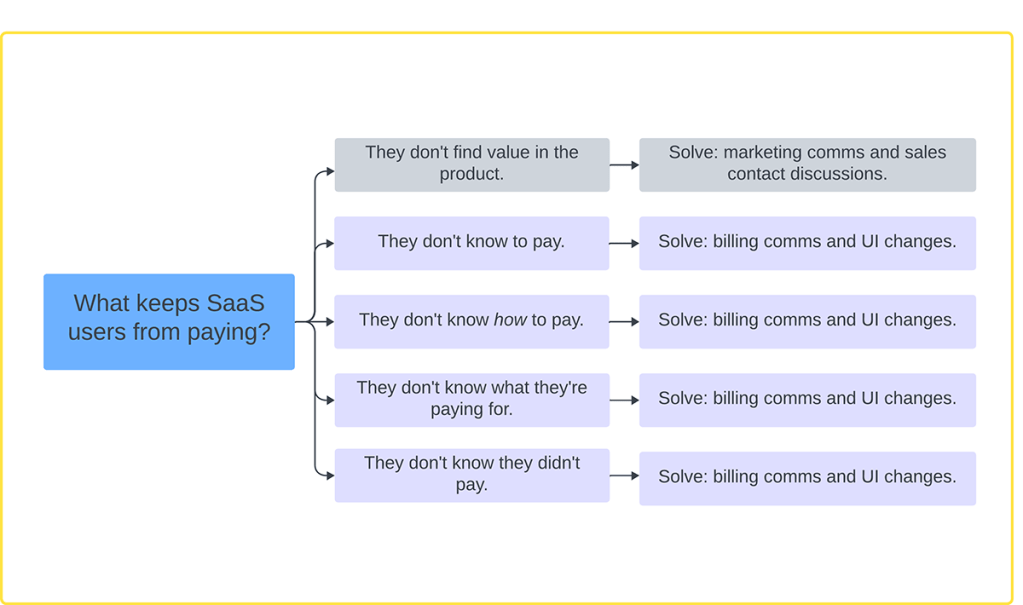
1. A broad framework would be created to analyze combined research – “What keeps SaaS users from paying?”
2. Deep competitive research to find out how clarity was provided in active and passive manners.
3. Product partners would focus on gathering qualitative and quantitative data to isolate pain points, strengths, and observations.
Finding out what keeps SaaS users from paying expanded out into five general issues that further refined research.

In this sequence, the four major issues (outside of marketing communications) are resolved as the user’s uncertainty is addressed, bringing confidence to decision-making.
Synthesis
In addition to confirming earlier thoughts on obstacles to payment, research yielded these conclusions on clarity:
- What’s paid for, how much is due, and when must be priority.
- Invoice lists must surface first and show status, billing period, due date, and be downloadable.
- The option to edit payment methods and preferences must be up front and easy to change.
- The broad communication gap regarding billing and how to access the subscription portal must be addressed through both marketing communications and sales staff communication.
Ideation and Design
With clarity defined, that knowledge was applied to the entirety of the subscription management portal, but more importantly, at its top level. The design:
- Implemented new information priorities in a human-centered experience.
- Reduced friction at all steps of the payment process.
- Structured design elements to make the best use of screen space.
- Gave the user more available actions at the top level of the portal.


