
In Brief
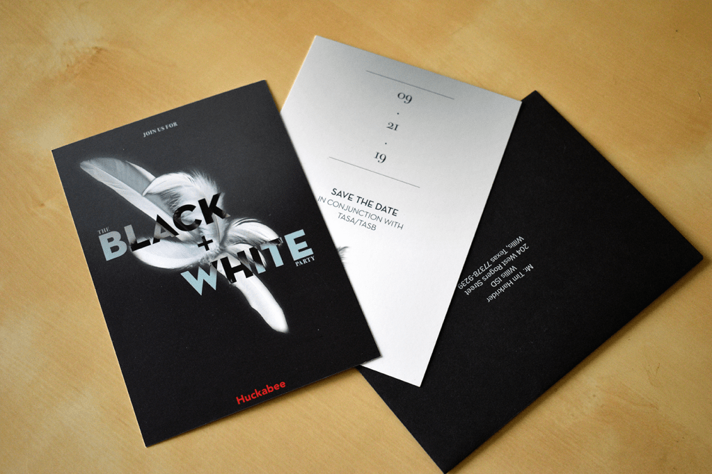
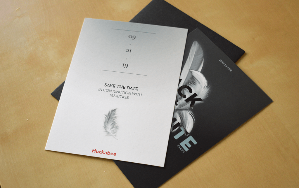
The Need: To celebrate each year with its clients, Huckabee Architects hosts the Black + White Party as the firm’s “commitment to education is black and white.” An invitation as always, is a need for the event.
Skills In This Case Study:
- Art Direction
- Project Management
The Result: A stunning new design direction of the party invitation, inspired by the fashion world and carried forward in the interior design of the event that resulted in 13% increase in response rate.
Refined Requirements
Fall is a busy time for the education community and for civic leaders, so getting on the calendar of those invited is a priority. It’s even more priority as the party coincides with a state education conference, where competition for time is fierce.
Art Direction Needs:
- A design language that suits the brand image of the firm
- A new, starkly different look that separates the invitation/save the dates from everything else received in the mail
- A design language that can be adapted into event interior design
Management Needs:
- Cost-effective, reliable, quality print sourcing
- Responsive print customer service
- Logistical planning for paper, ink, and coating sources, to include contingencies
- Invitation list sourcing, accuracy and mailing list application
Research
For the invitations/save the dates, these goals were identified:
- Determine an art direction that fit requirements as well as:
- Took advantage of current print design technology and trends
- Could be replicated should additional printing be required
- Could be replicated at more than one print shop should that be a need
- A flexible, dynamic workflow in case mailing lists change
Synthesis and Direction
Direction from research was as follows:
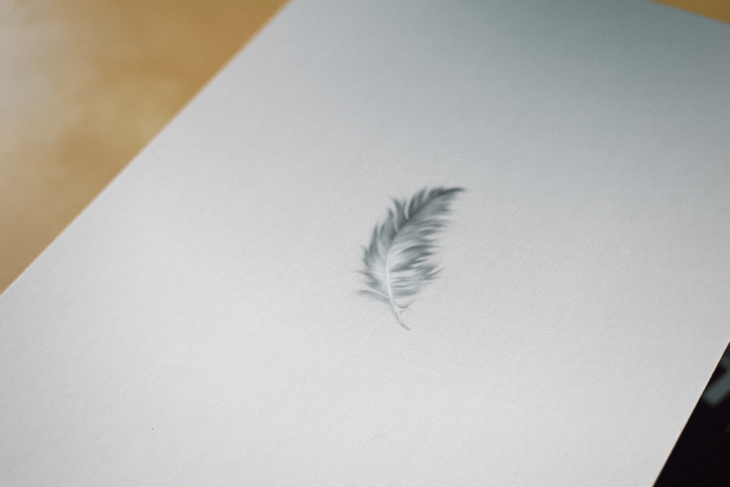
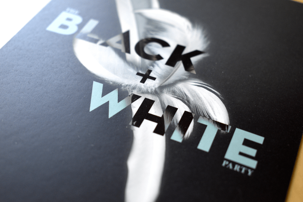
- Lean into the black and white name to create the aesthetic, using paper texture, coatings, and design to create a feel of exclusivity
- Carefully use the firm’s red color so it stands strongly from the rest of the design
- Choose a printer that works with digital printing for reduced cost, faster production, more flexibility, and improved reliability for a project of this size
- Combine cross-application mailing list creation and conversion processes that work with digital printing to complete the flexible workflow design
Additionally, research provided visual design elements, the ideal content tone, and video/photography styling for the campaign.
Implementation
All said and done, the project came together with:
- Digital printing on Classic Crest paper using a soft touch coating for the paper, followed by a reflective spot varnish over the letters and shapes, creating a stunning texture contrast effect
- Double-hit white ink over a linen texture envelope, ensuring incredible contrast between the deep black and brilliant white
- A mostly monochrome color palette, with a faint blue-grey and bold Huckabee red being the only elements not in black and white
- The creation of a flexible workflow used in following print projects that improved delivery time, reduced print waste, and enhanced coordination of efforts
